Project Overview
What is happening to our check out funnel in shipping?
Project: Shipping Abandonment User Research + Design
Role: UX Researcher + Designer
Platform: Website + App
Primary Tools: Google Slides, Figma, Contentsquare, Baymard Insights
Duration: 4 months+
In order for us to understand the user behavior in the checkout funnel and the reasons of the drop-off in each step, we have to understand user pain point, and address user needs that we need to cater. As a result we could come up with the solution to increase the checkout conversion rate as a goal.
Initial Challenges
How can we reduce the abandonment rate on our checkout funnel?
What are other Decathlon countries doing comparing to ours? Why is our abandonment rate higher than other countries?
To further expend the last question, what are other competitors doing in order to reduce abandonment rate?
Initial Solutions
Abandonment at checkout is common, initially thought to occur mainly on the cart and shipping pages. Data analysis will help form a hypothesis.
Comparing benchmarks with other Decathlon countries reveals areas for improvement. We can adopt strategies they've used to reduce abandonment.
Operational changes were discussed with the business team to enhance project outcomes.
Quick Monkey Testing
After reviewing 6 months worth of customer reviews (1000+), we found many delivery issues that need urgent attention. Some problems can't be solved by our digital products alone; we also need to improve our business efforts to enhance customer experience. Having warehouses in China can confuse customers due to varying shipping times. Additionally, since marketplaces are a major part of our business, handling delivery problems has become more difficult.
By using Contentsquare analytics platform, I discovered that shipping causes one of the highest drop-off rates during the checkout process. Many users expressed frustration when trying to add or change addresses, received unclear information on multiple parcels, faced confusion about shipping thresholds, and lacked clarity on pricing until reaching the shipping page. To validate these findings, I plan to conduct a test by selecting a product, adding it to the cart, completing the checkout process, tracking the parcel, and finally receiving the products—essentially evaluating the entire purchasing experience.
I chose some products my dad wanted, but I couldn't find shipping information on the product page about when I would receive them. I only saw that I needed to spend $399 for free shipping.
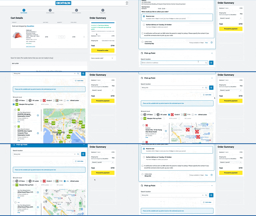
From the cart, I went to the shipping page, where I saw delivery options: store pickup, home delivery, or pickup points. Some details were confusing, and the delivery date was unclear. It said 3-5 days but didn't specify if those were business days or include weekends, and it didn’t provide a specific date.
Benchmark within Decathlon
Diving deeper on GA4, basket page has the highest abandon rate, at 49%. Whilst the behavior is similar compared to other countries: the average basket abandonment rate from other countries are at 45%.
The second drop-off is from the shipping step, at 43%. This behavior has a big gap compared to other countries: the average shipping abandonment rate in other countries are at 17%.
Login and Payment has the least drop-off, at 18% and 23% respectively which the behavior is similar to other countries
The overall checkout funnel completion rate for Hong Kong is 22%
As reference for completion on check out with highest completion countries:
Netherland - 43%
Belgium - 39%
Portugal - 34%
Germany - 51%
Poland - 50%
Spain - 43%
Hong Kong Product Detail page with no shipping information — only information was about the shipping threshold
Customer left a review saying website is a bit messy and shipping lead time is unclear and waited for 20 days
Since the shipping page has the highest drop-off rate, the PO and I agreed to focus our efforts there instead of other checkout pages. Because the shipping checkout page is the same for all countries, it's essential to review the entire customer journey to find other places users can see shipping information. By comparing product detail pages from different countries, I found that countries with higher checkout completion rates often include shipping threshold, price, and lead time information, while Hong Kong does not.
Examples of user review sharing their frustration regarding on our shipping
Additionally, Baymard Institute help sharing most common abandonment drop off is usually at the shipping stage.
Comparing to our GA data, it is on an acceptable range comparing to ours at the shipping drop off percentage — 42.68% vs. 48% (Baymard Insights)
Other reasons that can contribute to high abandonment rate that is relevant to us:
Delivery was too slow
Too long/complicated checkout process
Couldn’t see/calculate total order cost up-front
Return Policy wasn’t satisfactory
Diving a little deeper on the external research, it’s important to consider these factors in order for us to improve an overall customer experience.
Here we can see that —
49% of users prefer free delivery
17% of users prefer same day delivery
14% of users prefer fast delivery
9% of users prefer low cost delivery
With the omni-channel business model we have, it was easy for us to achieve same day delivery, and free delivery for users who’d prefer to pick up products from our store (Click & Collect).
However with home delivery (as one of our most popular delivery option), this can be a challenge to achieve lost cost to free delivery unless meeting the delivery threshold.
Research
Besides our internal benchmarking, it’s important to see how other businesses are tackling what could be a similar problem. By comparing to other big omni-channel businesses such as Home Depot, Amazon, Kohl’s, Lowe’s, Zalando, Nordstorm, and more, there were some interesting product features they’ve included that could greatly reduce abandonment by having a transparent shipping date instead of days, approximate price on the standard vs. express delivery options, and other information that could give users option to have same day delivery.
Home Depot one page check out also asks users to choose desired options for delivery
Office Depot one page checkout shows delivery options as well
HKTV Mall's one-page checkout displays the shipping responsibility and the number of parcels being sent
Zalando’s site shows approximate of the delivery date and pricing listed clearly on the cart page
Pain Points/Frustration:
Found out about shipping threshold and the available delivery options only at the delivery section (Decathlon products/MKP products)
Realize some products require longer lead time (12-18 days), and shipping can’t come together which require split parcels from different warehouses (Some next day, some 12 days later)
No delivery instructions options for users to provide on how they want the package to be delivered
Feels like the email/tracking on the package is too confusing/complicated — does not offer tracking status update
Affinity Map
Due to technical restrictions on our checkout page, I couldn't make many changes there. However, I had complete freedom to improve the product listing page. This allowed me to suggest various solutions to address user issues.
Need:
List out all delivery options (expected date + threshold) and stock from each store at PDP
Show shipping indication, “Order now, get product by XXX, July, 2024”
Clearer instructions + alternative ways through communication for users to track/check order status if delayed
Shipping threshold progress bar lets users see how much more they need to buy to qualify for free shipping.
Tutorial for users to learn how to use the new shipping information block in order to access finding available products from each retail store for pick up
Want:
Explore more pick up points and options, MKP seller ship to store (+$40-$50 on top of product), and Decathlon retail store group the order together for pick up
Giving optional delivery instructions (Scheduled Delivery) to customize delivery time
Free delivery threshold per seller (as we tested joint cart threshold with Decathlon products would not work in the long run)
Business Changes — unify the shipping requirements for marketplace sellers to reduce confusion about fulfilling them amongst each marketplace sellers
Mid Fidelity Prototype
After sketching on pencil and paper with different variation of changes, and making sure the website overall had a good flow, I brought my low-fidelity paper wireframes into Figma to developed a more streamlined and visually appealing mid-fidelity prototype.
Desktop, Mobile (App with Mobile View)
Decathlon PDP
MKP PDP
High Fidelity Prototype
A/B Testing
The shipping information component is only implemented for Decathlon product page. It will also base on the product unit price to display the cost of the delivery fee (when price reaches the free delivery threshold, the delivery fee will be FREE).
In mobile version, the component will be below the fold if we keep the existing structure of the product page, in conclusion, we’ve decided to move the product catchline below to increase the visibility of the shipping info component.
Experiment type: Test to Learn
Testing period: 3 weeks (31 Jan - 21 Feb)
Traffic Allocation: Random split 50% users on product page
Primary KPI: Shipping abandonment
In the first two weeks of the test, we see that there is a positive and consistent trend in improving the shipping abandonment rate.
However, starting from 13th Feb, the result is opposite, the shipping abandonment rate of variation group has been higher than the control group. And this higher shipping drop-off in variation happens to all types of order: Split, non-split, pure-Decathlon, Marketplace.
Overall, we do not see a significant results on improving / harming the shipping abandonment.
Secondary KPI: Cart-to-detail, buy-to-detail rate
Cart-to-detail uplift of 6.05% - significance 100%
Buy-to-detail flat test
The cart-to-detail rate of variation group is outperforming than the control group and the result is consistent and significant during the testing period.
There is drawback on the buy-to-detail rate, and has no significant uplift which results into a flat test.
As the results have significant increase the upper shopping funnel on adding products to cart, the delivery information block on the product page has been launched permanently.


