Project Overview
What is Kollabo?
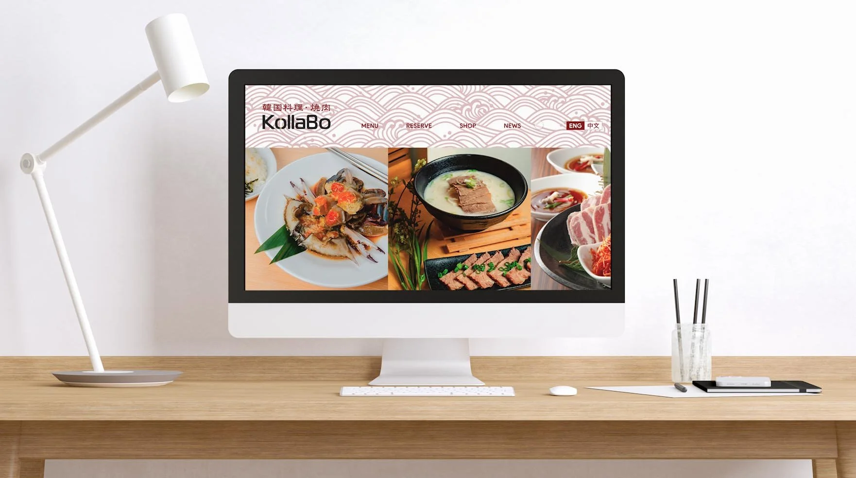
Kollabo is a Korean BBQ restaurant collaborating with various bbq style and side dishes in with the region/province in Japan (25 and currently expanding). Hong Kong Branch (Tai Koo) is the first branch that’s under a new management.
Project: Kollabo Website (Hong Kong)
Role: UI UX Designer
Platform: Website (Responsive)
Tools: Adobe XD, Figma, Illustrator, Aftereffects, Premier Pro, Photoshop, Pen & Paper, Post-it Notes, Marker, Grid Paper
Duration: 1.5 months
Participants: Epicurean (Client), David Cheng (Developer), Jari Yang (Developer)
CHALLENGE
How can we incorporate a new brand identity while making this new website easy to navigate and generate returning customers to make reservation with us?
SOLUTION
Identify the information needed for website, conceptualize the brand identity and apply on website, and make adjustments based on user testings.
Pain points:
Disorganized menu
No reservation system
Unable to navigate throughout the website
Need:
Clear navigation bar
Organized menu
Reservation/enquiry form directed to the mailbox of parties within the management group to react.
Want:
A clean modernized website
Design and brand to fit Korean and Japanese culture
“About us” is not the priority therefore doesn’t want to include at navigation bar, reservation/enquiry form
RESEARCH
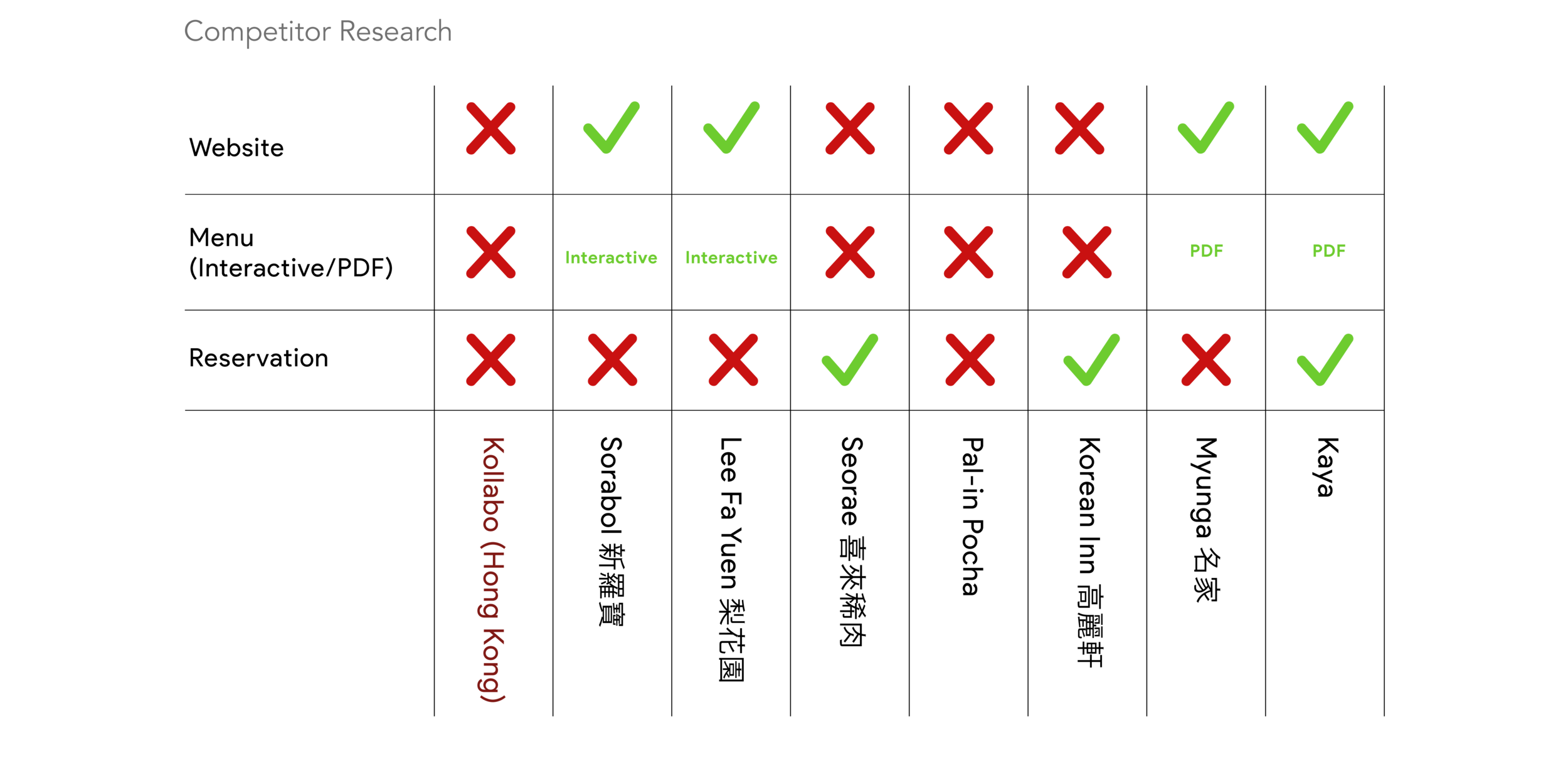
In order to have a clearer idea on what is needed vs what is wanted. I’ve conducted a research on competitors that runs a very similar business as Kollabo. The competitors include: Sorabol, Lee Fa Yuen, Seorae, Pal-in Pocha, Korean Inn, Myunga, and Kaya.
Out of 7 restaurants we conduct a research on the needed features for the website:
Website: 42% of the restaurant does not have a website, while 57% of them do.
Menus: 42% None Available, 57% on either interactive page or PDF.
Reservation: 57% None Available, 28% available on facebook page, 14% only available on website
With Hick’s law, I’ve categorize and break down the information given by the marketing team in smaller sections on a menu bar to give them lesser choices to choose from. Here’s the affinity map of the break down to the information needed for the website before carrying onto the site map.
AFFINITY MAP
SITE MAP
After organizing the information above from the Affinity Map and Site Map, it is now time to work on a persona profile and customer journey to a scenario.
PERSONA & CUSTOMER JOURNEY MAP
Meet Warren Lee…
Warren works as an assistant to marketing manager at a fin-tech start up at Tai Koo. He is half Japanese and Korean and loves to explore new restaurants around Hong Kong. He had just successfully pitched and won over a huge client that he worked very hard on with his team. He wanted to have a nice team lunch where he could share part of his roots to his team mates. He tried looking around the restaurants near Tai Koo Shing and see what’s out there. Most Hong Kong restaurants do not have a website up and cannot make any reservations online.
Scenario
Warren end up being quite upset he has been planning to take everyone out for lunch after the meeting for awhile. However, there wasn’t any way he could at least get a respond/confirmation after making reservations. He seems frustrated that most places do not have a website and has to result into going through Openrice app to look at the menu photos taken by others and reading reviews to see what’s there to eat.
After doing the affinity mapping, site map, persona and user journey map, I have a very clear idea on how to structure the website. Looking into the pain points of Warren, he wasn’t able to check what’s featured on the menu for a restaurant and able to make reservations. Due to that, I wanted to mainly focus on these main features to start building website for Kollabo. Here are some mid-fidelity wireframes that were drawn out filling in most of the information I’ve put together on affinity map and site map.
MID FIDELITY WIREFRAME
DESIGN SYSTEM
HIGH-FIDELITY MOCK UP
PROTOTYPE VIDEO
USER TESTING
I’ve conducted interviews of a total of 6 people to test the website and its usability. 83% of the users say that the website was intuitive and self explanatory.
All of them agreed that:
The menu being “bookmarked” to each category, they were able to access quickly what the restaurant offers.
Quick to fill out form for reservation instead of calling consistently to the restaurant and staffs were too busy to pick up.
Design of the website is sleek and easy to navigate even being first time visiting.
Staffs also noted that time was used more efficiently during busy hours because:
It’s less time to go through convos on jotting down basic information to confirm their reservation.
Reservation was able to link up instantly to their shop pad where they had a quicker way to get back through confirmation email on table’s availability in designated time slot.
Menu is interactive online and customers know what they’re expecting when they come.
What Can I Improve On?
Looking back, there were couple things I could've done better on:
If given opportunity, I would want to conduct more user interviews and get feedback from how the website works on this initial stage so there are more things to be adjusted slowly
Push the “About Us” section to its own page so it can give consumers more history and credibility on the collaboration of the restaurants.
Put a call to action button on the page fixed position on the bottom right corner to have a constant reminder for users whichever page they’re on.


