Project Overview
What is Italian Tomato?
Italian Tomato is a Japanese bakery brand that’s umbrella to multiple brands. Italian Tomato brand features Italian Tomato Cafe, Cafe and Grill Italian Tomato, Fari-buerre, & Wasabou Kamamura Yumemiya. The app Tomato Club has over 30k downloads from multiple platforms.
Project: Italian Tomato Website Update (Multiple Sectors), Cake Ordering System, Cake Ordering on App, Internal CMS System (Website Only)
Client: Italian Tomato
Role: UI UX Designer
Platform: Website + Mobile App
Tools: Adobe XD, Photoshop, Illustrator, InDesign, Principle, Pen & Paper, Post-it Notes, Marker, Grid Paper
Duration: 6 months+
Challenges
How can we merge the functionality and customer profile from pre-existing Italian Tomato cake ordering page that looks very different to the current design?
What’s the best way to easily organize and filter categories within the cake section so it’s easier for users to navigate and quicker to reach their goal?
Solutions
A consistent page to the Italian Tomato website and app in order to order cake (Brand identity match)
Merge categories that is repetitive and work on a transparent solution for users to know when their goal will be reached
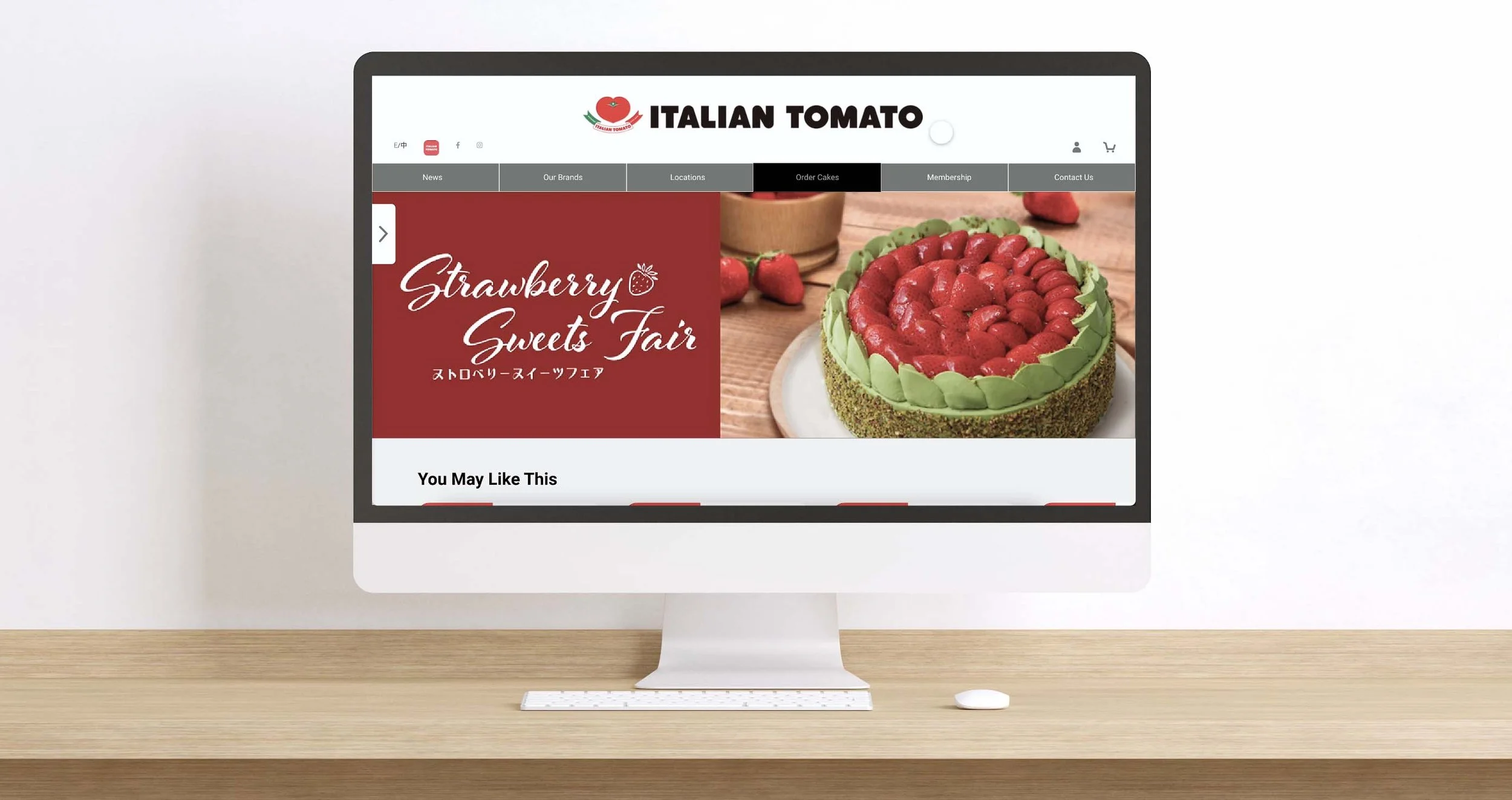
Cake Ordering (Home VS Cake Ordering)
Current Home Page of Italian Tomato
Cake Ordering Page after clicking (Order Cake)
Current Website Pages
I started by research with a website observation from visiting their current site.
Things I found that were problematic:
Current web page is not intuitive, abrupt changes on the cake ordering
Location of the page is not user friendly, hard to find certain shops and locations
Does not allow any user error on some pages where user can go back for changes
Only option to place promotional order is to call in, delivery services not available
RESEARCH
In order to get a more detailed analysis, I’ve identified some of the problems by conducting 2 heuristic evaluations (App and Website) using LEMeRS methodology to get a better understanding on the hypothesis for users pain points before interviews and further research.
This is the heuristic evaluation based on the website
This is the heuristic evaluation based on the app
Knowing there are a lot of problems on the website and app, what are the competitors doing?
I conducted a competitive & comparison analysis on 4 other businesses as Italian Tomato’s competitors. Due to the price range of being similar, I’ve picked Maxim’s Cakes, Saint Honroe, Cháteraisé, and Lucullus. This process allowed me to clearly understand the differences between the bakery shops and to gather useful information towards part of the redesign for the website and app. Most of the bakery brands has delivery option for their products, and intuitive user experience on the apps. Saint Honore is the only one with an in-app ordering service option; Maxim, Italian Tomato and Lucullus are all connected to the website platform for cake order. However, Italian tomato does not automatically shrink to the responsive size of the cake ordering page on mobile size.
Now I’ve collected enough information of what needs to be included for some of the problems, I also need to understand user pain points and frustrations from different perspectives. I decided to collect qualitative data by conducting user interviews and to collect quantitative data by posting online surveys.
I asked the users to do one simple task:
Try to order a cake by using Italian Tomato website on App and Website
Out of total of 5 user interviews and 23 online surveys, I was able to summarized the information I got into these charts:
INTERVIEW QUOTES
Pain Points/Frustration:
Cake order page and Italian tomato page are separated
Can’t log in/order cake on app
Unable to order some promotional cakes listed on order cake page, does not have a reserve/which location has this cake availability option.
With Italian Tomato’s 5 sister companies and its branches, users have to look through all addresses to find their targeted location
Want:
Quick cake ordering system implemented
Delivery Service
Filtering option to the cakes
Need:
Cake ordering system (both App and Website)
Location filtering for brands and branch
Client profile to be merged to the main website
Maintain similar design throughout all pages
Meet Sofia Choi…
The User Persona Sofia was generated based on user research to help guide through my design process.
A journey map was put together after 5 usability tests by giving users the task to order the cake on the website, in order to help visualize user frustrations.
Sofia’s User Journey Ordering Cake from Italian Tomato’s Current Website
Sofia’s colleague is having a birthday coming up. She wanted to prepare a cake for her colleague to celebrate together. After browsing around, she saw Italian Tomato is doing their seasonal promotion where the Japanese Peaches as a theme for the cakes. She directly went to the cake section to order the cake. Unfortunately, the only size is in cm (21 cm) as standard and can only order in quantity (No bigger proportion). She then add the cake to cart without thinking much, then remembered she forgot to write greeting, was a bit annoyed that there wasn’t a reminder that she hasn’t input anything. By going further into the ordering, there wasn’t a delivery option. Sofia had no extra time during lunch to get the cake, she closed the website and went look up somewhere else.
AFFINITY MAP
Users find the style of the cake ordering site transition very different and gets confused on the brand. There are also changes that needs to be made on the location page as well. To better understand what needs to be on both app and website, I’ve put together some existing and added new features.
New feature includes:
Flash Pick up (Couple hours prior pick up)
Filtering on location and brands
Suggestion on different cake promotions
A new site map on both app and website was generated based on card sorting results. I organized parts of the current website into a more fluid, and simple one. Some of the changes I made were:
Removed the category of 15cm, and combine cakes in multiple sizes on the products page
Added flash order option for people who wants to pick up their cakes asap (an hour to next day)
Save the order as template for future ordering
Organize the flow by breaking down information on the products page leading to finish purchase
USER SCENARIO
Sofia heard great things about Italian Tomato’s sweet strawberry cream cakes and wants to try it out with her friends at a gathering. After a long day, she wind down to look into Italian Tomato website to order.
Once I had a solid site map redesigned, I was able to figure out Sofia’s user flow based on user scenario.
PAPER WIREFRAMES
I started sketching all the ideas on grid paper. With the user flow, affinity map I’ve done before, I locked down some key features and buttons required for each page after a few changes.
MID FIDELITY PROTOTYPE
After conducted 3 usability tests on both App and Website, and making sure the website overall had a good flow, I brought my low-fidelity paper wireframes into Adobe XD to developed a more streamlined and visually appealing mid-fidelity prototype.
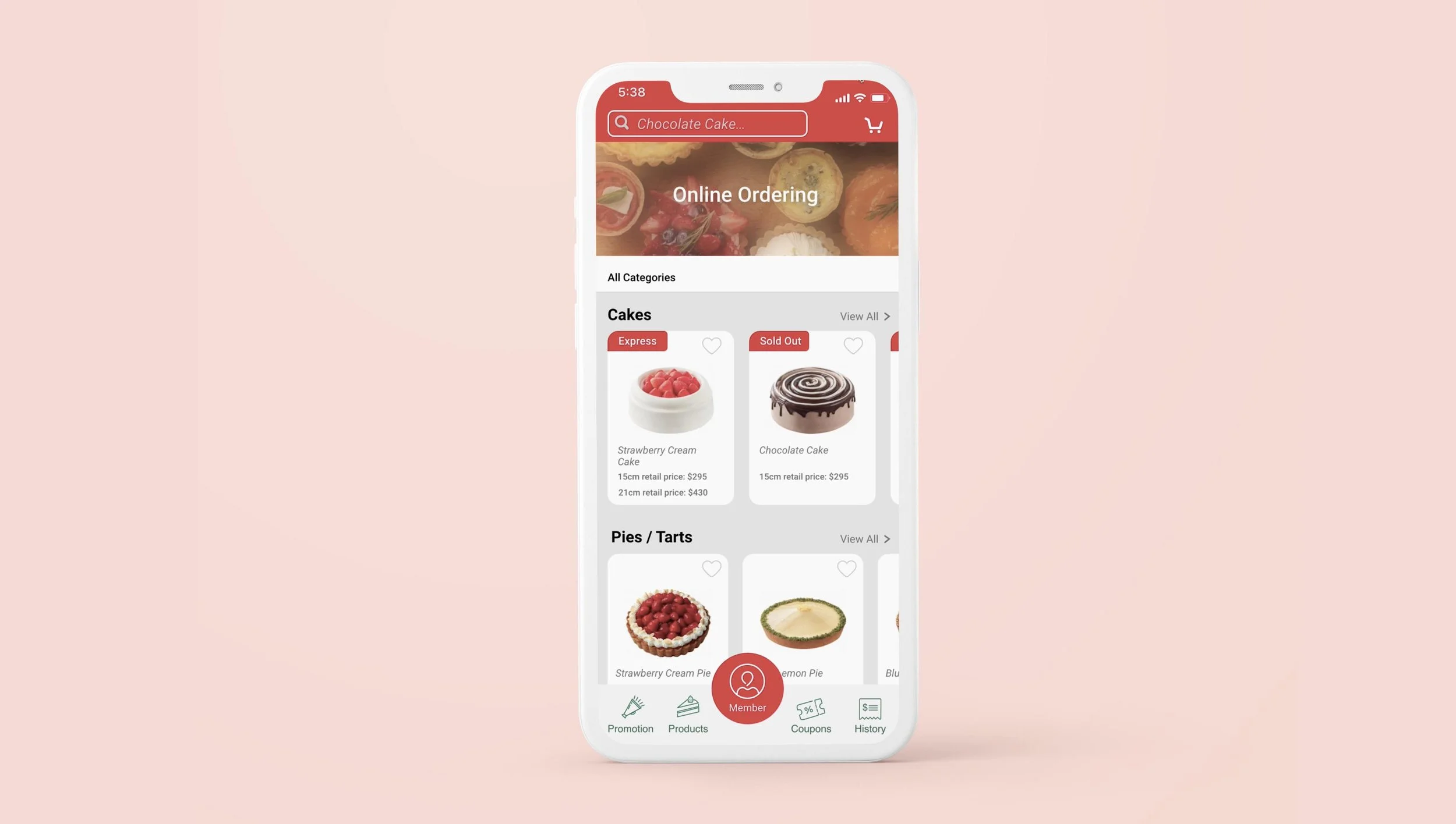
APP
WEB
DESIGN SYSTEM
HIGH FIDELITY PROTOTYPE
Animated Button
Button Animation to add dynamic feel to elevate an experience
PROTOTYPE VIDEO WEB + APP
I’ve conducted interviews of a total of 5 people to test the website and its usability. 5 users came from different background and age. 3 of them are technology savvy while the other 2 are not. 80% of the users find this new layout for cake ordering system to be intuitive and easy to navigate.
All of them agreed that:
The cake ordering system both on website and app seems to belong to the brand and was consistent.
Buttons were intuitive and easy to navigate towards a goal
Easy to choose a location of branch to pick up cakes when needed, and was happy to be able to pick a designated time slot to pick up.
Some of them struggled to:
Utilize the tags and category options on the app to filter out some choices they were hope to see, wish to have more categories.
Mistakenly see the same tag of express and sold out on the app function, wishes to have color code/differentiation.
What Can I Improve On?
Looking back, there were couple things I could've done better on:
Besides the given colors of red and green, I would create a range of the similar color scheme and tone to add more energy into the website and app while keeping the original brand theme direction from Japan.
Organize and categorize the tags into different groups so it would be easier to look for the tags on website and immediately be associated to the ones on app.


