

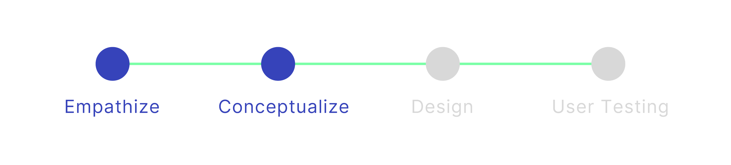
Project Overview
What is Decathlon Marketplace?
Project: Decathlon Marketplace UX Enhancement
Role: UX Researcher + Designer
Platform: Website
Primary Tools: Google Slides, Figma, Contentsquare
Duration: 6 months+ (includes research to implementation)
Decathlon Marketplace is a platform where Decathlon partner with other sellers/vendors in order to offer variety of products to customers in order to make sport accessible for all sport users. Their products are listed on Decathlon websites as one catalogue and Decathlon partners with brands like Nike, Adidas, YONEX, Wilson, and more to close the offer gap.
Initial Challenges
How can we implement and educate the store concept to users so they can easily distinguish marketplace brands from Decathlon brands?
How can we give users a clear understanding of return policy between Decathlon products and Marketplace products are different? How can users be able to quickly identify the different terms and conditions that vendors set for each product/their own shop?
How can users be able to distinguish between Decathlon and Marketplace (third party seller handles shipment) shipping at the check out page to lower abandonment rate?
Initial Solutions
Find a way to differentiate marketplace and decathlon products by adding on elements such as: logo, colour, stickers, tags. We can educate users difference between marketplace & Decathlon by making subtle changes
Highlight marketplace sellers’ terms and conditions and make it visible for users to access, linking it to the full terms PDF
With the differentiator appearing on Decathlon products, it can then help users differentiate between packages that’s directly shipped from Decathlon or Marketplace third party seller — However, on operation perspective, it’s optimal to have all sellers unify their terms and conditions for better expectation management.

Discovering Problems
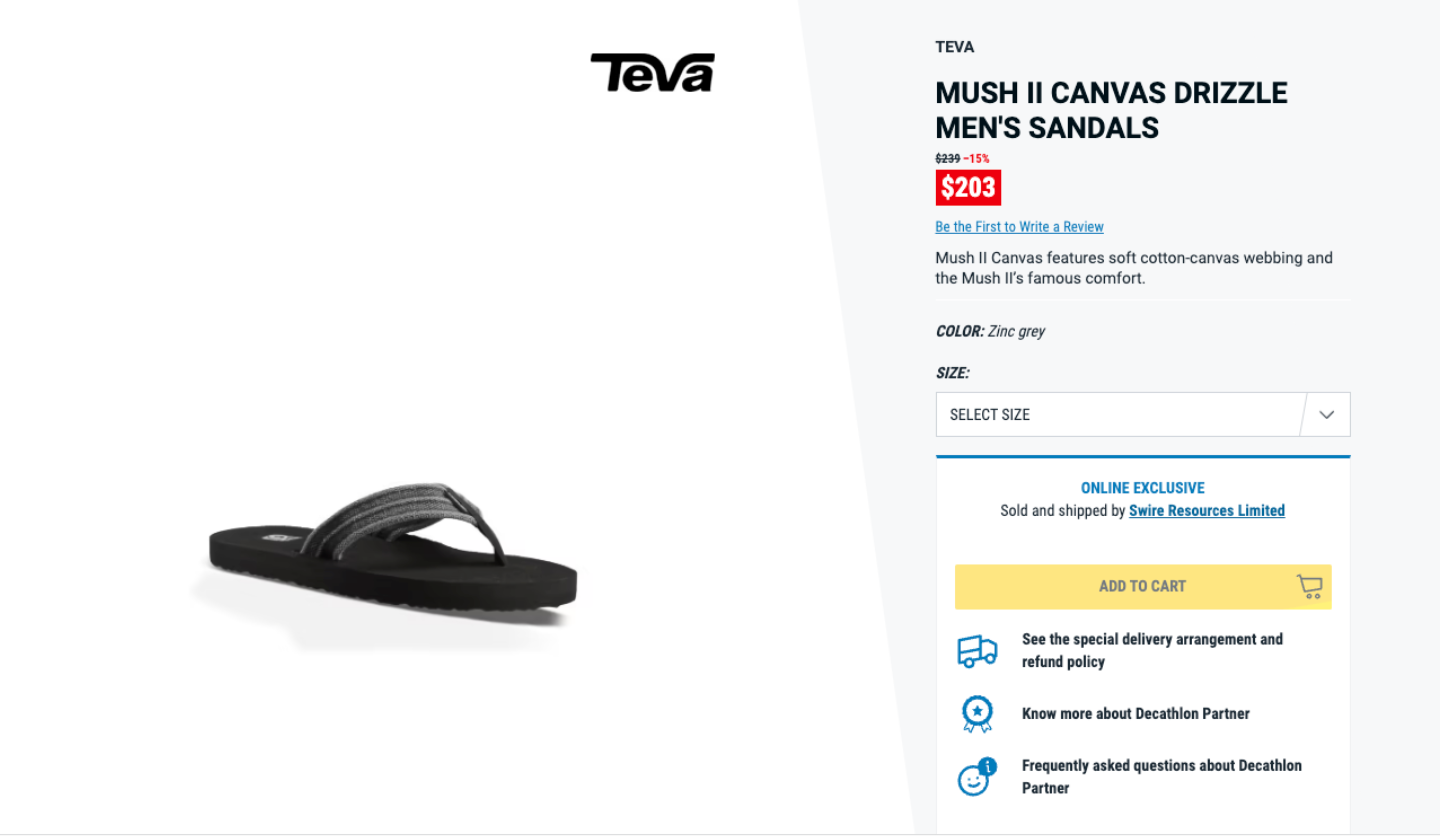
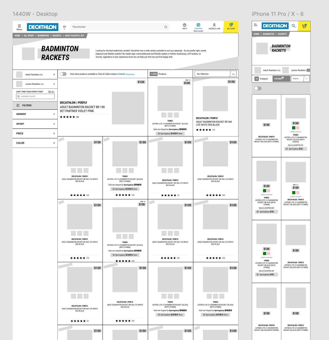
Desktop - Overall product description page for Marketplace product
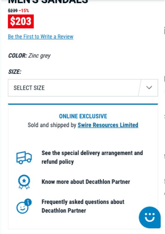
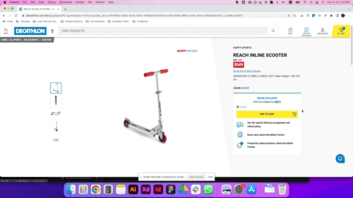
Mobile + App - The Conversion Zone of the Marketplace product
When users land on our product page, they have to really look for our terms and conditions. As Decathlon has its own T&C, each seller has their own return and shipping policy. It is unclear on the website and users needed to go through the hyperlink of the seller’s name to see a seller profile where the terms and conditions are in a pdf under a hyperlink
Current Marketplace Product Page
I initiated this project by speaking to multiple store teammates and customer service teammates on the most commonly pain points they’ve had to deal with on a daily basis at the store and online.
The first thing multiple teammates across different stores and teams have mentioned:


An example of user review complaining about our third party seller terms and conditions
Research
From the concerns above, it was clear that on one hand our Marketplace has a wide range of products to close our offer gap, on the other, it has seriously impacted our post purchase experience with our customers. To date, we have over 300+ third party sellers on our platform. In order to kick off this research, I started by studying the business data and journey mapping of our own website in the eyes of customer.
Using Contentsquare as a journey mapping and session replay tool, it was clear that customers were hesitant to complete a purchase due to the fact that they are unable to differentiate Marketplace third party sellers and each one of them have different shipping and return policies. Almost none of them was able to enter the T&C to read details and filed complaints on misalignment with Decathlon product return policies.
With this solid insight, next step was to compare e-comm competitors who run a similar business model to have a better idea on how they tackle a similar user pain-point.
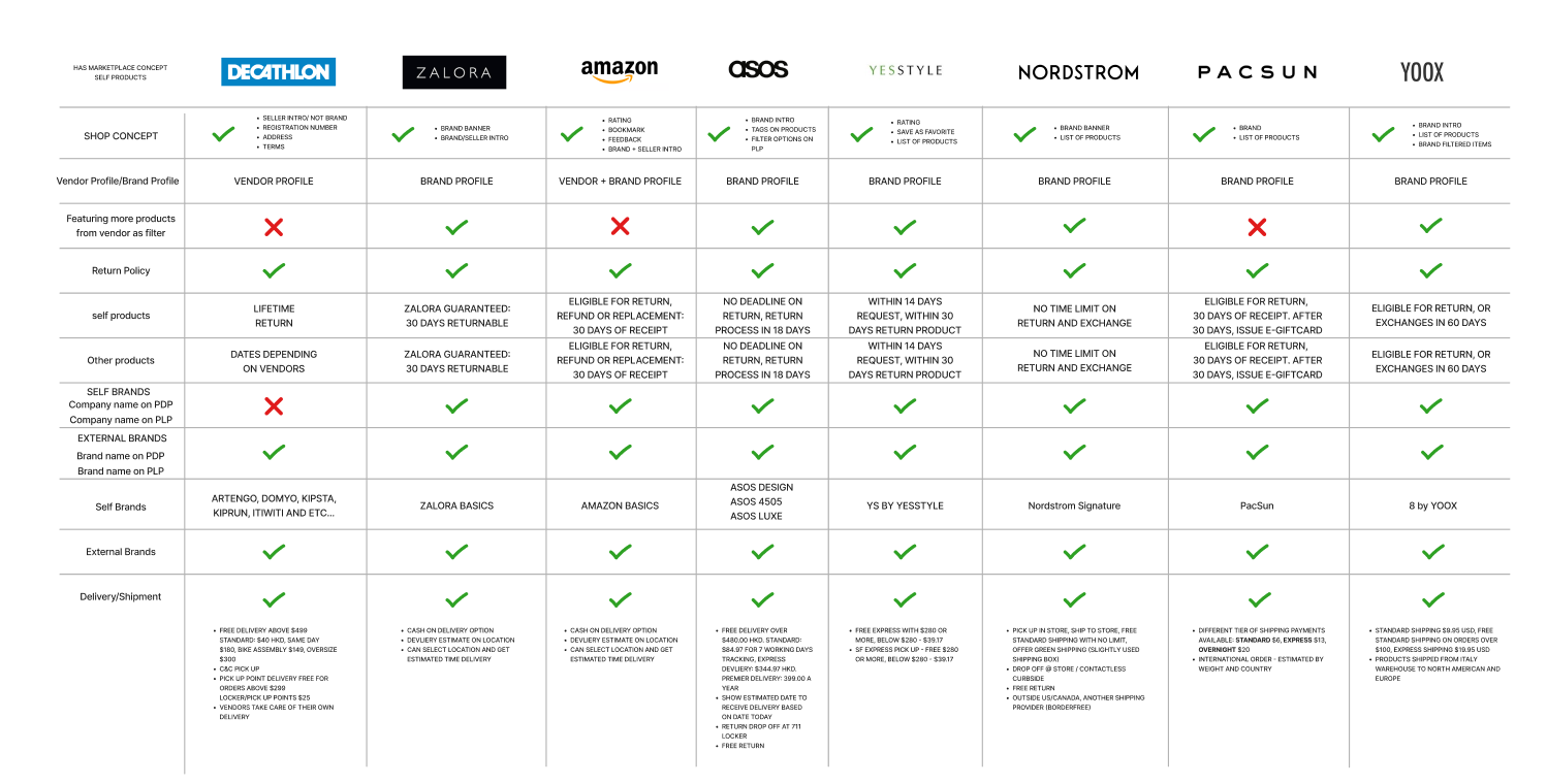
Reflecting on this research, it was clear that some of these competitors had to tackle the same or similar problem — users have been facing these problems from not just Decathlon, but other omni/e-commerce as well. After this research, the pain points are more clear.
Pain Points/Frustration:
Users are not able to differentiate between Decathlon and Marketplace third party products on both listing and product page
Different return and shipping policy in between different partner sellers (depending on the sellers) and Decathlon (lifetime return)
Shipping fees for different sellers which is only visible at the check out funnel on shipping page (eg. $40 from seller A + $50 from seller B = $90 total shipping cost for 1 order)
Partner seller products are only online exclusive and customers come to store looking for them
After identifying a precise pain point and user frustration, it’s now easier to put together a user persona that can relate to the problems shared above.
Meet Phillip and Janice
Two personas were created from real user feedback - Using real user feedbacks is easier for business stakeholders to understand the urgency of this frustration as they are the voice of our customers.
Phillip
(Overall Summary to this persona) Phillip, just like our other customers, loves shopping on our website. However, he abandoned on the check out funnel because every seller has their own different shipping fees. Although the products he buy are all from the same sport, there’s no way he can see if seller A can provide the same products/or anything similar that seller B has in order to meet the free shipping threshold for seller A. He feels frustrated he has to pay shipping fees for multiple users and decides to go to seller A’s website to see their full catalogue to find the right product.

Janice
Janice — on the other hand, is a working mother. Just like Phillip, for convenience, she prefers to have products ship directly to her home. Her daughter picked a swim suit she wanted, and when they found the time to visit the store, Janice was informed that this was an online product. Being disappointed, Janice and her daughter looked around but found nothing her daughter liked. Decides to make a general guess to purchase the size online, and when swimsuit arrived, it was too loose on the waist area which can effect her daughter’s performance on the competition. Janice later returned and realize that it has passed the seller’s 7 day return policy. She felt deceived as there isn’t any information on the website to state otherwise.

Affinity Map

There’s a strong urgency to now back up what type of features we need for this user experience journey. Before design, it was important to look at what feature we have on our existing pages and identify what will be needed in order to improve the whole user experience.
Need:
Differentiator labeling needs to appear on every page including home, product listing, and product detail page.
Clear return policy on not just product detail pages, but also on the seller profile page
Dynamic return date appears on the product detail page to give users clarity on purchasing this product with a dated return terms
Want:
By adding the online exclusive tag, users will now be able to have a clear indicator that this is only available online
Creating a seller storefront on their existing seller page will give users an option to buy products from a seller’s listing in order to avoid duplicated shipping fees from other sellers
Branded listing page will also let users know that there are multiple sellers selling the same brand products (Nike, Adidas, Asics).
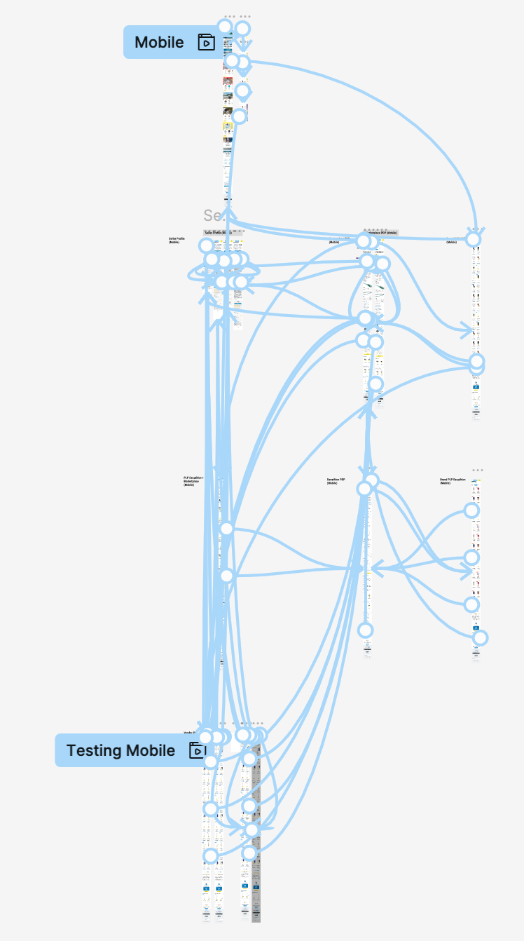
A new site map on both app and website was generated based on card sorting results. I organized parts of the current website into a more fluid, and simple one. Some of the changes I made were:
Includes a brand listing page for both Decathlon own branded products vs. third party marketplace seller when users are able to then have an overview of all products under one brand on a listing page — ex: Nike, Puma, Crocs
Addition to our existing Marketplace seller’s page, users are able to enter the seller store front where they can view all products listed under a particular seller with a more clear return policy and their shipping policy


Mid Fidelity Prototype
After sketching some wireframes on whiteboard, and making sure the website overall had a good flow, I brought my low-fidelity wireframes into Figma to developed a more streamlined and visually appealing mid-fidelity prototype.
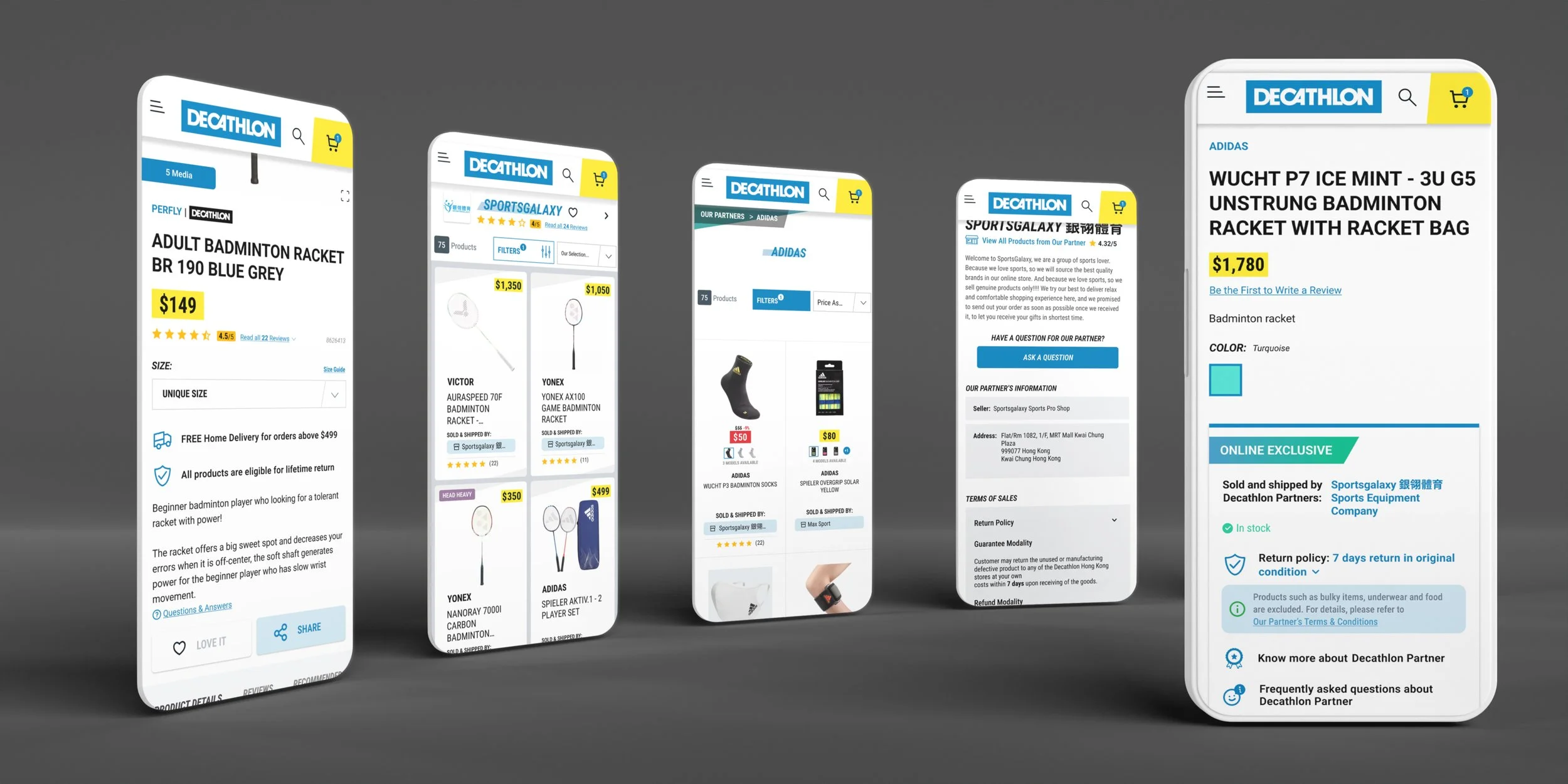
Desktop, Mobile (App with Mobile View)


High Fidelity Prototype


A/B Testing
The idea of this design is to allow user to differentiate between Decathlon and Marketplace products with a clear indicator. The variation also serve as an entry point for users to access the seller storefront which allows user to discover all products of the seller.
It is a multipage test, user in the variation group will see the variation on the homepage, listing page, and search result page, which provide a seamless behavior across the journey.


Experiment type: TEST TO LEARN
Testing period: 07 Dec - 28 Dec
Traffic Allocation: Random split 50% users on homepage, list page, search page
*It is a multipage test, user in the variation group will see the variation on those page types
Primary KPI: cart-to-detail rate
Uplift of 6%
Variation has a better cart-to-detail rate which the behavior is aligned on both Decathlon and MKP products. This indicates that with the differentiator, users have higher intention to add to cart after clicking to the PDP from the listing page. This positive impact also aligns with mobile and desktop version.
Secondary KPI: buy-to-detail rate, entry point usage
Uplift of 8%
The variation has a better buy-to-detail rate which the behavior is aligned with the previous results on cart-to-detail. It’s a much more significant uplift with multiple entry point usage. 60% of users are accessing the seller storefront page from the product detail page, and 20% from listing page.
KPI on the storefront access
On other performance, does the seller storefront help user to convert? For sessions who has access to the seller storefront, it has higher CVR, AOV and Cart-to-detail%. In details —
Conversion rate has increased from 1.49% to 2.93%
Average order value has increased from $560 to $794
Cart-to-detail increased from 5.85% to 11.07%
Other projects I’ve worked on…

Decathlon Shipping Abandonment Case Study
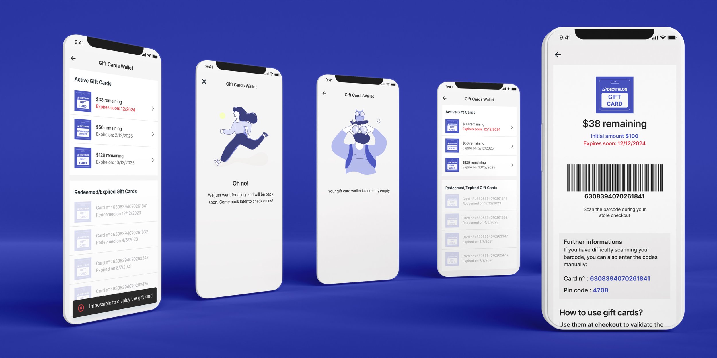
Gift Card Wallet

Italian Tomato